Tuesday, November 28, 2017

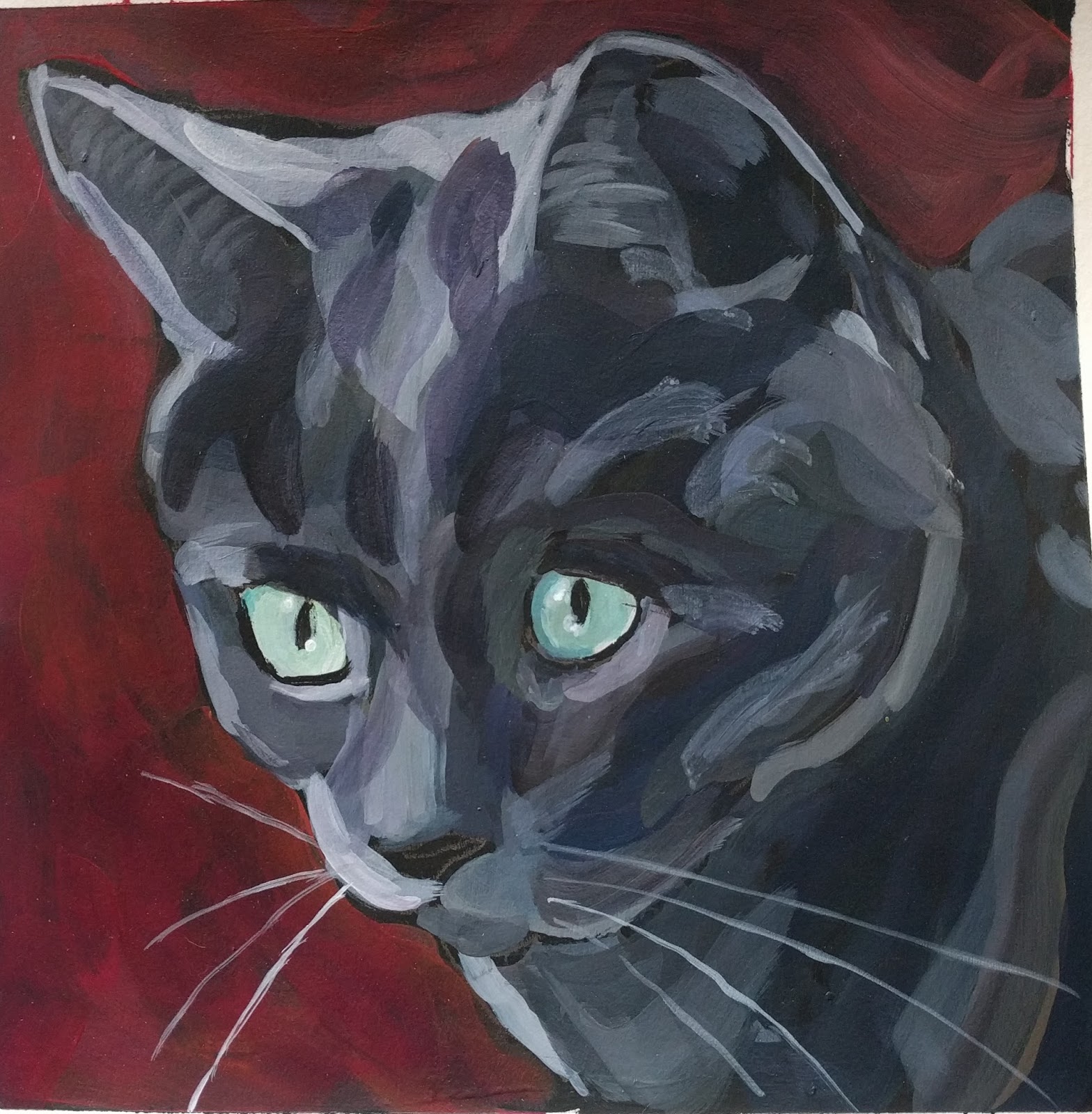
From The Shadows

It would be a huge understatement to say that I am enjoying doing 4-value paintings. I am having an absolute blast. Likely, I will do a few more. After that I might tweak it a bit and go for a color other than gray. The gray scale and value finder is turning out to be an invaluable tool.

Here is the start of my new painting. Even with only one color (really two, if you count the background), the cat emerges especially when viewed from a distance.


Here is the finished painting. I like these dark backgrounds, where the cat is emerging from the shadows. This cat, Dorian, has a very level and intense way of looking at me and this technique captures that.

Dorian in 4-values - 8" x 8" - on paper - alternative blue
It's just shocking to me how so little can convey so much, especially with the eyes. When I look at the left eye of the first one that I painted and this one, I can't believe how a few small paint strokes can read so well. I also think these paintings are helping my eyes. For example when I was mixing the second lightest color, I "guessed" with my eyes before checking it with the gray scale and value finder. Hurrah, it confirmed for me that I was pretty close to the value that I wanted. That is one of the reasons that I would like to extend this experiment using colors other than gray.

Sunday, November 26, 2017

The Follow Up Painting

In all truth, the idea to do paintings in neutral colors using 4-values began with a homework assignment from Kat Corrigan this spring. The assignment was to paint a sink, preferable a kitchen sink, several different ways with different parameters. One of those was to paint it in gray scale. This assignment made me nutty. At the time, I thought the biggest challenge was figuring out what to do, which mostly had to do with composition. Looking back, some of the other problems were making values distinct enough and finding the shapes in the objects.

For this assignment back in May, I struggled and painted several boring and not very good paintings of my bathroom sink. I never posted any of these at the time, since I was not happy with them. Here is one of them.

May 2017 - gray scale homework
As I paint and write in this blog, I think and write about values and shapes a lot. That, along with the gray scale painting exercise in May, and my new app, Notanizer, percolated and came out as an idea to do 4-value paintings. It turned out to be a good idea. Plus, it was a good painting exercise to use while I was back in my hometown over Thanksgiving visiting family. Part of my comfort zone for painting is being in a familiar place, alone.

I was thrilled with the painting of Hammett in my last post. Generally when this happens, the next several paintings are cursed, since I psyc myself out somehow. Instead, I had another good experience with another 4-value painting of a cat. This is Wingnut.

#161 - Wingnut in 4 Values - 8" x 8" - STD palette
For this one and the one of Hammet, I used a gray scale and value finder tool. After mixing a colors, I checked the color against this tool. I’m still finding that I need to add much more white when going lighter. I added a fifth value and tried to include a tiny bit of the shape of the cat’s body, rather than just the face.

I noticed something new. I tend to be heavy-handed with my brush, so I tried to vary the downward pressure on my brush. If I can keep at it, I hope to be able to paint better cat whiskers.

This experiment has been amazing. It is all about values and shapes. Color and details just don’t matter in the same way that values and shapes do. It’s like values and shapes are the cake and all the rest is the icing.

Thursday, November 23, 2017

That Was One Of My Better Ideas

Over the Thanksgiving holiday, I figured that I would be distracted (which I am), but I also wanted to keep up with my painting practice. Several days ago, I thought it might be interesting to work on painting in neutral colors and to really, really focus on values and shapes.  My self-assigned game was to pick several pictures and paint from them using 4 levels of values by using the app, Notanizer. I also decided to stay with neutral colors.

Here is the result.

#159 - Hammett in Values - 8" x 8" - STD palette
This was a pretty incredible experience and this painting came together quickly. This exercise helped with a lot of things. First off, I really had to slow down to see the 4 different levels of values when I was looking at the picture. I kept switching between the view to get 3 levels of values versus 4. I could easily see the lights and the darks, but it was hard to distinguish the 2 middle levels of values. It was a bit frustrating to realize this. I think I have two issues. One is that my eyes just aren’t good at seeing values, and I hope to improve over time, plus I don’t always slow down as much as I should. 

I only needed 3 shades of paint to represent 4 values. I decided to mix one shade of paint and paint all instances of that value. This is not my normal practice. I tend to jump around a lot. I painted the second lightest value, followed by the lightest value, and finished up with the second darkest value. What this caused me to do was also to slow down and really think about each paint stroke, place them well, and also make sure that I captured all places that contained the value that I was working. I did have to do some minor touch-ups, where I missed one of the lighter values.  

This is all elementary stuff. It’s the basics, really. I just struggle to slow down and focus enough at times. Many times when I’m painting, my mind races ahead and wants to be further along in a painting than I am.  

Last, but not least, when I was done and stepped back, it was surprising at how much the fussy little details don’t matter.  The basic shape and parts of the cat read just fine without them.

Tuesday, November 21, 2017

Modified

I modified the eyes a bit to make them less flat. They still need more work, but I'm not going to re-do, my re-do. I'm ready to move on.

This is part of the learning process in using white paint to lighten things. I need to use a lot more. I still don't seem to make my lights light enough.


Here is the original. In person, there is a greater difference between the two than in these photos. 


Monday, November 20, 2017

Comparison

Here are two paintings created approximately one month apart from each other. It's interesting to compare these two each other. For each one, I noted below what I liked better.


#156 - Ella - 8 x 8 on paper using standard palette
I finished this one today. While I was painting it, I relied quite a bit on the app, Notanizer. With this app, I can easily look at pictures with 4 levels of values. Over Thanksgiving, since there will be a lot going on, I am thinking about focusing on cats and just painting from Notanizer and 4 levels of values. I might even try to go for all neutrals with each color. The finished results should be interesting and I hope to learn more about seeing and using values.

When I compare this painting to the one below, here are some of the things I like better about this one:
  • Brighter colors and relatively lighter values.  
  • The background color. 
  • The paint strokes.
  • The right side of her face.
#148 - Ella - 8 x 8 on paper using alternative blue
For this one from a month ago, Here's what I like better:

  • The left side of her face.
  • The eyes.
  • Her expression. 

Thursday, November 16, 2017

Two Quick Sketches That I Like

I did both of these sketches on Monday. One of my clients has a few items on display from the Field Museum in Chicago. It's hard to take a break and go and draw, but I did it for about 5 minutes on Monday. I did two sketches. This is the better one. It is a northern waterthrush.


Later in the evening, I took another short sketching break and did a quick one of my hand. While the proportions are a bit off since the thumb is too long and the hand could be wider, I like the curl and interconnection of the rest of the fingers.


I like both of these sketches. I've looked at this page in my sketchbook several times this week and when I do, I find myself smiling each time.

Monday, November 13, 2017

Busy, Busy, Busy, Busy

In spite of being busy, busy, busy, busy, I have been drawing and painting every day. Although, it's not as much as I would like nor as much focused as I would like. Painting comes at the beginning of the day. If it's a work day, I may only spend 5-10 minutes, but that's better than skipping a day. Plus, it is a great way to start the day. No matter what the day is going to bring, I start it with a bit of high-quality me time. Drawing mostly comes at the end of the day. While I post almost all of my paintings, I'm only posting an occasional drawing.

I finished this painting yesterday. While I'm not thrilled with the paint strokes in the flower, I do like the colors. I found a new app to help with values. Value Viewer is app that I was using and I love that one, but it has not been updated to the new iOS. Notanizer is the app that I found last week and will use until, hopefully, Value Viewer gets updated.

#156 - Pansy in Purple Pot - 8" x 10" - alt blue
 I have also been drawing. I signed up for Liz Steel's Foundations class awhile back. I am only on the second lesson. This is partly because I've been busy and partly because I got distracted with leaves. I really enjoyed drawing leaves and I miss them.

This is a blind contour drawing from one of the exercises. It's almost relaxing to do these. You know you aren't going for a finished drawing, but you are working on getting your eyes and hands to work together better. While I was drawing this, I was thinking about edges and lines. While these never end up looking like much, I do see progress! I did not cheat at all by looking either time, so I was pleasantly surprised with the "relative" cohesion. In both drawings, I set up and used a box of Morton's salt with a bowl of small, homegrown potatoes in front.


This was followed up with a continuous line drawing. Those pesky ellipses are still a challenge and I didn't quite get the potatoes positioned in the bowl. The second try with just the bowl was better.  


Last, but not least, when I came home from work late one night rather frazzled, I did a partial drawing of a cut up pepper followed by drawing the right side again, since I wanted to improve upon my first attempt. It still surprises me how much my brain will feel almost cleansed after doing a bit of drawing where I am concentrating. After some of my long days at work, I've really needed that!