 |
| #171 - Sadie - 8" x 10" - paper - std palette |
Sunday, December 31, 2017
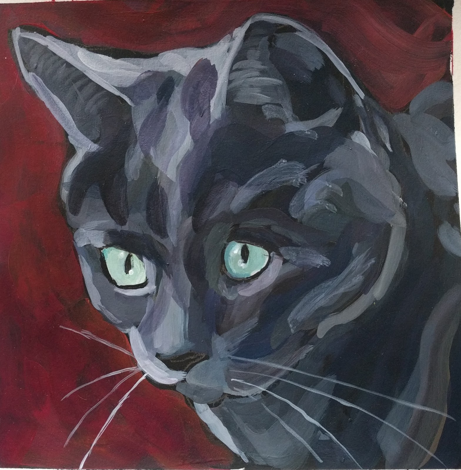
Sadie
This gets you to my first attempt. This gets you to attempt #2 through #7. It's still not quite there, but attempt #8 is getting much closer.
Friday, December 29, 2017
Year-End Painting Review
Two years ago on 12/29/15, I walked into a morning class at Wet Paint with Kat Corrigan and painted my first painting. I signed up for the class mostly on a whim and it was a birthday / Christmas present to myself. While I had already made a New Year's resolution to work on learning to draw in 2016, this class made me add painting to this goal / resolution. What a wonderful two years it has been. I like looking back. It's the main reason for this blog. It helps me capture where I was at and how I was feeling at the various steps in this journey. While there is so much to learn, it makes me profoundly happy that picking up a pen, pencil, or paint brush to try and capture a moment or image has become a normal activity in my life as compared to January 2016. Back then, putting a line on a piece of paper was anxiety-producing.
A lot of good things happened with my painting practice in 2017. First of all, I figured out how to fit in daily painting during a very, very, busy time this fall. Each day, I get up and paint. On most work mornings, this might mean only five minutes, but even in this short amount of time it is a good way to start a day. I also figured out that I have trouble maintaining focus at times, so painting in shorter spurts has actually helped.
After two years, I'm beginning to understand some of the basics. This includes mixing paint colors with the limited palette that I use. With paying more attention and experimenting a bit more, I figured out things like using more blue when mixing the tans and light oranges found in orange tabby cats or making grays more neutral. Some of this came from starting a second palette with a different blue and a different yellow, which caused me to slow down and think more about what I was doing.
The biggest change happened over Thanksgiving when I had a major breakthrough with values and shapes. On the one hand, it's frustrating. Why did it take 2 years? Every bit of information out there focuses on these two concepts. I took classes. I read books and blogs. I watched videos. I thought that I was listening to the message, but I wasn't really hearing it. Experiential learning is like that sometimes. Understanding comes in its own time.
On the other hand, who cares. The message finally started to connect and it has improved my painting. I want to bring this over to my drawing in 2018. While I got better with line drawing, I mostly outline things and haven't figured out how to add depth, dimension, and volume. Working on values and shapes should help and this is a goal of my drawing practice in 2018.
To finish up this year-end review, I looked back on the paintings that I completed in 2017. Here are four of my favorites from throughout the year. This one is from January 2017. I am not sure what to say about this one. I just like it, although maybe I included it so there would be one non-cat painting.

Next up is Chandler in the sink from May 2017 from when I was in a small group that met with Kat. She would give us homework assignments and the assignment was to paint your kitchen sink. I ignored that and went with the upstairs or downstairs bathroom sink. Trying to build any type of interesting composition was beyond me. I was having trouble mixing colors. My values were off. I did 4-5 paintings, which were disasters. Then one morning, Chandler was being Chandler and he crawled into the bathroom sink. I took some pictures. This put me back in my comfort zone, I was painting a cat with an unusual background.

This one and the next one tie for my favorite paintings of 2017. This one is the breakthrough painting from November 2017. I was back in my hometown over Thanksgiving and decided that I would try painting 4-value paintings using the app, Notanizer. This is the first one I did. I painted this standing in the basement of the Airbnb where we were staying. I did not paint a cat. I painted the shapes that I saw in each of the values. It just flowed off of the brush. Yes, it is on the stylized side, but I love this painting. It makes me happy whenever I look at it. With this one and all of the other 4-value paintings, I still can't get over how little you need to actually paint an eye (or the entire cat for that matter). Both of the eyes in this painting are 3 fairly small paint strokes. Overall, this experiment really got me thinking.

My other favorite painting of 2017 is from December 2017 and, of course, it is a cat. It's great when you capture the physical essence of something. It's even better when you luck out and also capture part of the spirit. This is Jacques and I like this one because it captures a bit of the Jacques-ness of Jacques.

A lot of good things happened with my painting practice in 2017. First of all, I figured out how to fit in daily painting during a very, very, busy time this fall. Each day, I get up and paint. On most work mornings, this might mean only five minutes, but even in this short amount of time it is a good way to start a day. I also figured out that I have trouble maintaining focus at times, so painting in shorter spurts has actually helped.
After two years, I'm beginning to understand some of the basics. This includes mixing paint colors with the limited palette that I use. With paying more attention and experimenting a bit more, I figured out things like using more blue when mixing the tans and light oranges found in orange tabby cats or making grays more neutral. Some of this came from starting a second palette with a different blue and a different yellow, which caused me to slow down and think more about what I was doing.
The biggest change happened over Thanksgiving when I had a major breakthrough with values and shapes. On the one hand, it's frustrating. Why did it take 2 years? Every bit of information out there focuses on these two concepts. I took classes. I read books and blogs. I watched videos. I thought that I was listening to the message, but I wasn't really hearing it. Experiential learning is like that sometimes. Understanding comes in its own time.
On the other hand, who cares. The message finally started to connect and it has improved my painting. I want to bring this over to my drawing in 2018. While I got better with line drawing, I mostly outline things and haven't figured out how to add depth, dimension, and volume. Working on values and shapes should help and this is a goal of my drawing practice in 2018.
To finish up this year-end review, I looked back on the paintings that I completed in 2017. Here are four of my favorites from throughout the year. This one is from January 2017. I am not sure what to say about this one. I just like it, although maybe I included it so there would be one non-cat painting.

Next up is Chandler in the sink from May 2017 from when I was in a small group that met with Kat. She would give us homework assignments and the assignment was to paint your kitchen sink. I ignored that and went with the upstairs or downstairs bathroom sink. Trying to build any type of interesting composition was beyond me. I was having trouble mixing colors. My values were off. I did 4-5 paintings, which were disasters. Then one morning, Chandler was being Chandler and he crawled into the bathroom sink. I took some pictures. This put me back in my comfort zone, I was painting a cat with an unusual background.
This one and the next one tie for my favorite paintings of 2017. This one is the breakthrough painting from November 2017. I was back in my hometown over Thanksgiving and decided that I would try painting 4-value paintings using the app, Notanizer. This is the first one I did. I painted this standing in the basement of the Airbnb where we were staying. I did not paint a cat. I painted the shapes that I saw in each of the values. It just flowed off of the brush. Yes, it is on the stylized side, but I love this painting. It makes me happy whenever I look at it. With this one and all of the other 4-value paintings, I still can't get over how little you need to actually paint an eye (or the entire cat for that matter). Both of the eyes in this painting are 3 fairly small paint strokes. Overall, this experiment really got me thinking.
My other favorite painting of 2017 is from December 2017 and, of course, it is a cat. It's great when you capture the physical essence of something. It's even better when you luck out and also capture part of the spirit. This is Jacques and I like this one because it captures a bit of the Jacques-ness of Jacques.

Thursday, December 28, 2017
Christmas Painting Present
Nope, it's not what you think. My niece wanted acrylic paint and I didn't want to decide the brand, type, or colors in case she had something specific in mind. On Christmas Eve, I decided to paint up some trading cards that she could trade for the actual paint when we went on a shopping trip. I had fun doing this, although the experience really made me a fan of red and less of a fan of yellow. The longer the word, the harder it was to fit and paint around. Each of the cards was something like 5 inches long.


I also gave her one of the Masterson's sta wet palette and a few other supplies. Yesterday, we went shopping and got her the paint! I hope she has fun playing with it.

I wrote up a card for her and tucked the trading cards in that. Since I was on a roll and feeling silly, I decided to write on the back of the card. Coupons always have so many legalistic warnings that a grabbed one and copied the warnings with a few revisions on the back of the it.

Monday, December 25, 2017
Dorian
I finished this on 12/23/17. I started drifting back to being a little more fussy with details rather than shapes. Also, the face and position of the body are not quite right. Through a combination of the alternative yellow being a bit stronger and paying more attentions (because of the new yellow), my grays are closer to neutral.
Currently, it seems easier to focus on shapes with creatures who did not live in my home.
 |
| #170 - Dorian 8" x 10" - paper - alternative palette |
Friday, December 22, 2017
Hummingbird - Take 2
I started this one back in the middle of Thanksgiving. After drawing it out and starting the bird, it got put aside. It was my main project this week.
I did not fuss with this one nearly as much as the first time back in October. Plus, the values are better in this one. I am so glad for the breakthrough over Thanksgiving. I just feel a bit more in control of an important aspect of painting!
This one will get another try, since I want to figure out better paint strokes for the flowers. There's also the issue of masses of shapes versus painting the individual flowers and I'd like to explore and play with that.
 |
| #158 - Hummingbird In Flowers - 8" x 10" - paper - alt palette (both blue & yellow) |
This one will get another try, since I want to figure out better paint strokes for the flowers. There's also the issue of masses of shapes versus painting the individual flowers and I'd like to explore and play with that.
Sunday, December 17, 2017
Something New
I've never tried to paint sheep before. This is from a picture of a sheep and a very sweet lamb that I took back in 2015 when I went to a class at Kristin Nicholas' farm house. It makes me wish that I had taken many, many more pictures of the sheep.
This was a bit of a challenge for a number of reasons including:
 |
| #169 - Sheep and Lamb - 5" x 7" paper - alternative palette |
- It was painted on a small surface, although I did use a smaller brush..
- I have never painted sheep before. There are unique things about each animal that you figure out after awhile.
- There are two subjects close together. I still mostly play it safe and stick with one thing at a time.
- I'm transitioning back from 4-value paintings to trying to see more nuances than 4 values.
This may sound like a bunch of excuses, but it's not. I did find myself bouncing in my head between painting shapes and painting sheep.
I'd like to revisit this one or a different sheet, but go for a larger size.
Palette Update
This is mostly a note to myself. I changed my alternative palette. It now contains both the alternative blue and the alternative yellow.
The specific colors are located here.
The specific colors are located here.
Friday, December 15, 2017
A Happy Finish
This is Jacques. He is a big, sweetie-pie of a cat owed by friends of mine.
I painted this as a "regular" painting, not a 4-value one, although I am being much more mindful of values these days (now that I see them or realize that I don't see them well enough, so I check them using Notanizer).
 |
| #168 Jacques - 8"x 8" on paper - std palette |
Wednesday, December 13, 2017
A Happy Start
I pulled out a new #10 bright brush and started this painting. It just felt good, plus I am feeling better. Last night was the first night in a week with a good, mostly uninterrupted night of sleep. Until last night, it seemed like I was waking up every 20 minutes or so coughing.
Anyway, these paint strokes just felt lush and happy to me.

Anyway, these paint strokes just felt lush and happy to me.

It Is A Cat
On Monday morning, I finally started getting my brain back from the never-ending cold of 2017. I actually felt like picking up paper and a pencil and drawing cats. I played around with different things for 20 minutes or so. At one point, Hammett was sitting on the back of the recliner and suddenly I saw him in shapes. I did a rough sketch in pencil and filled in the lines much darker so you can see them. Ignore the horrible lines in marker that are bleeding through the other side of the paper.
It was interesting seeing him as a collection of shapes and in a very simple form.

It was interesting seeing him as a collection of shapes and in a very simple form.

Tuesday, December 12, 2017
It's Not A Cat!
That's what he said when I first showed him this painting.
This one was painted both from looking at the original photo (below, which was cropped) and a version of the photo in my beloved app, Notanizer. I'm not sure that I would have painted the darkest parts of the flower dark enough if it wasn't for the app. When you look at the flower in 4-values with this app, the darkest parts of the flower are black. My eyes / brain still want to stay, but wait! I know it's a dark value, but how can it be that dark when the native color is white. Actually, that's not 100% true. I'm finally starting to get it, but it's taken a long time and I suspect that I will continue to struggle with this. It made me think about the donut painting from painting class last fall and the follow-up donut painting. While I may not be the quickest at picking up on these concepts, I don't give up either.

 |
| #167 - Peony In Yard - 8" x 8" - paper - alternative blue |

I think my lightest colors in the flower and the darkest ones are pretty good. The middle values could probably use some more distinction between them. I've wanted to try and paint from this picture for some time, but didn't know how to approach it. I knew that I didn't want to try and paint every petal, so I wasn't sure what to do. What I decided was to try a mix of going with the shapes and going for the feeling of the petals.
For a person who loves bright, bright colors, it always surprises me how much I enjoy painting different types of white. When I looked at the picture, there were yellowy whites, gray whites and pink whites.
I did this in one sitting, yesterday. It went fairly quickly. I'm still getting over my cold, so the analytical part of my brain was too tired to get in the way. That made doing the background easier. For a change, I didn't over-think it.
Sunday, December 10, 2017
Just Ignore The Green
I get rules in my head, so sometimes I set out to break them. That's how I ended up painting a green cat. This painting is from yesterday. I did it in one sitting and it came together fairly quickly.
This started as another 4-value painting, although it morphed to five values even before I went even farther with it. Throughout this painting, I also tried to have more paint on my brush.

After I painting the original values and shapes, I decided to add a background.

From there, I added another dark color to define the cat, since the black parts looked odd with the background. I wish I would have taken two more progress pictures. The first several paint strokes of the extra dark body color did amazing things. Next, I finished all of the formerly black background with a dark green. It would have been good to take pictures of both of these steps. However, my energy level was terrible and I didn't feel like going upstairs two additional times to take pictures in natural light. I have been fighting and, mostly, losing the battle with a wicked cold this week.
The very last thing was suggesting the other eye. The finished result is below. It was fun pushing this to completion.
Here is a painting from the same source picture from back in August 2016. Even with the hideous green, this painting reads so much better. It's all about the values and the shapes (which is the mantra that I need to keep repeating to myself).
Also in all of these value paintings, it's been amazing to me how little you need to represent an eye. This is especially true of the suggested eye that I added at the last minute. It's just one stroke with a tiny, tiny highlight and it adds so much!
This started as another 4-value painting, although it morphed to five values even before I went even farther with it. Throughout this painting, I also tried to have more paint on my brush.


From there, I added another dark color to define the cat, since the black parts looked odd with the background. I wish I would have taken two more progress pictures. The first several paint strokes of the extra dark body color did amazing things. Next, I finished all of the formerly black background with a dark green. It would have been good to take pictures of both of these steps. However, my energy level was terrible and I didn't feel like going upstairs two additional times to take pictures in natural light. I have been fighting and, mostly, losing the battle with a wicked cold this week.
The very last thing was suggesting the other eye. The finished result is below. It was fun pushing this to completion.
 |
| #166 Marvin In Green - 8" x 10" in paper, regular palette |
Also in all of these value paintings, it's been amazing to me how little you need to represent an eye. This is especially true of the suggested eye that I added at the last minute. It's just one stroke with a tiny, tiny highlight and it adds so much!
Saturday, December 9, 2017
Quick And Simple
I started this on Monday and finished it on Thursday. Each morning, I only had a few minutes to work on it. Plus, I have been fighting a monster cold, so my energy level has been less than zero.
I liked the idea of leaving a lot of the space unpainted. Most of the time, I feel compelled to fill every bit of surface with paint.
I liked the idea of leaving a lot of the space unpainted. Most of the time, I feel compelled to fill every bit of surface with paint.
 |
| #165 Chandler In 4 Values - 5" x 7" on paper |
Wednesday, December 6, 2017
In Other News.......
I am home sick today. I don't stay home sick very often, but I have a cold and it sapped all of my energy. If I take it easy today, I hope to bounce back sooner.
I don't just sit very well. Last night, I finished knitting the thumbs for a new pair of gloves and washed them. They dried on the radiator last night. While there are two of them, it was easier to take a picture of one of them and I am all about going with the easy route today.

I have needed a new pair of gloves for a long time and, fortunately, I got them done just in time for colder weather. I have short, stubby fingers, so handmade gloves fit me so much better!
Saturday, December 2, 2017
A Trio Of....
I'm a tad obsessed with 4-value paintings of cats. Since it's good to switch things up (even though I am doing the same exercise on the same subject matter, so the irony is not lost on me), I decided to switch a 5" x 7" format and play with background colors. My thought was that if I liked any of these, I could put them into Art 4 Shelter next year.
Here is my work since my last post. Painting in the morning for a few minutes and fitting in additional time when I can has kept me painting each and every day. I've gotten over feeling like I need a big chunk of time to paint. As a result, I paint more and finish more, even though life is very busy!
I am just going to call this one a warm up. My darkest paint color (my second darkest value) should be lighter. Especially when viewed from a distance, the two darkest values merge together. Also, I had trouble using a #8 sized brush. Things just did not gel with this one.
I took several in-progress photos of the next one.


While I really enjoyed the beginning stages of this one, I'm only okay with the finished result on this one.
I was still using the #8 size bright brush on this one. For this one and the last one, I felt as though I regressed away from just doing the shapes and ignoring the details. Plus, it was more difficult to work smaller.
I finished this this morning and like it the best.
I used a #6 brush and that helped. I tried to be less fussy. The picture had the dramatic lighting that has been working well. Working in this way has been a valuable experience and I feel like I am learning tons. It will be interesting to see what creeps into my color paintings when I switch back to those. Although, I'm not quite ready to go back to that. Next, I want to try a few of these paintings using a different color than gray.
Here is my work since my last post. Painting in the morning for a few minutes and fitting in additional time when I can has kept me painting each and every day. I've gotten over feeling like I need a big chunk of time to paint. As a result, I paint more and finish more, even though life is very busy!
 |
| #162 - Ella In 4-Values - 5" x 7" paper - alternative blue |
I took several in-progress photos of the next one.


While I really enjoyed the beginning stages of this one, I'm only okay with the finished result on this one.
 |
| #163 - Chandler In 4-Values - 5" x 7"on paper, - alternative blue |
I finished this this morning and like it the best.
 |
| #164 - Marvin In 4-Values - 5" x 7" on paper - std palette |
Tuesday, November 28, 2017
From The Shadows
It would be a huge understatement to say that I am enjoying doing 4-value paintings. I am having an absolute blast. Likely, I will do a few more. After that I might tweak it a bit and go for a color other than gray. The gray scale and value finder is turning out to be an invaluable tool.
Here is the start of my new painting. Even with only one color (really two, if you count the background), the cat emerges especially when viewed from a distance.

Here is the finished painting. I like these dark backgrounds, where the cat is emerging from the shadows. This cat, Dorian, has a very level and intense way of looking at me and this technique captures that.
It's just shocking to me how so little can convey so much, especially with the eyes. When I look at the left eye of the first one that I painted and this one, I can't believe how a few small paint strokes can read so well. I also think these paintings are helping my eyes. For example when I was mixing the second lightest color, I "guessed" with my eyes before checking it with the gray scale and value finder. Hurrah, it confirmed for me that I was pretty close to the value that I wanted. That is one of the reasons that I would like to extend this experiment using colors other than gray.
Here is the start of my new painting. Even with only one color (really two, if you count the background), the cat emerges especially when viewed from a distance.

Here is the finished painting. I like these dark backgrounds, where the cat is emerging from the shadows. This cat, Dorian, has a very level and intense way of looking at me and this technique captures that.
 |
| Dorian in 4-values - 8" x 8" - on paper - alternative blue |
Sunday, November 26, 2017
The Follow Up Painting
In all truth, the idea to do paintings in neutral colors using 4-values began with a homework assignment from Kat Corrigan this spring. The assignment was to paint a sink, preferable a kitchen sink, several different ways with different parameters. One of those was to paint it in gray scale. This assignment made me nutty. At the time, I thought the biggest challenge was figuring out what to do, which mostly had to do with composition. Looking back, some of the other problems were making values distinct enough and finding the shapes in the objects.
For this assignment back in May, I struggled and painted several boring and not very good paintings of my bathroom sink. I never posted any of these at the time, since I was not happy with them. Here is one of them.
I was thrilled with the painting of Hammett in my last post. Generally when this happens, the next several paintings are cursed, since I psyc myself out somehow. Instead, I had another good experience with another 4-value painting of a cat. This is Wingnut.
I noticed something new. I tend to be heavy-handed with my brush, so I tried to vary the downward pressure on my brush. If I can keep at it, I hope to be able to paint better cat whiskers.
This experiment has been amazing. It is all about values and shapes. Color and details just don’t matter in the same way that values and shapes do. It’s like values and shapes are the cake and all the rest is the icing.
For this assignment back in May, I struggled and painted several boring and not very good paintings of my bathroom sink. I never posted any of these at the time, since I was not happy with them. Here is one of them.
 |
| May 2017 - gray scale homework |
As I paint and write in this blog, I think and write about values and shapes a lot. That, along with the gray scale painting exercise in May, and my new app, Notanizer, percolated and came out as an idea to do 4-value paintings. It turned out to be a good idea. Plus, it was a good painting exercise to use while I was back in my hometown over Thanksgiving visiting family. Part of my comfort zone for painting is being in a familiar place, alone.
I was thrilled with the painting of Hammett in my last post. Generally when this happens, the next several paintings are cursed, since I psyc myself out somehow. Instead, I had another good experience with another 4-value painting of a cat. This is Wingnut.
 |
| #161 - Wingnut in 4 Values - 8" x 8" - STD paletteI |
For this one and the one of Hammet, I used a gray scale and value finder tool. After mixing a colors, I checked the color against this tool. I’m still finding that I need to add much more white when going lighter. I added a fifth value and tried to include a tiny bit of the shape of the cat’s body, rather than just the face.
I noticed something new. I tend to be heavy-handed with my brush, so I tried to vary the downward pressure on my brush. If I can keep at it, I hope to be able to paint better cat whiskers.
This experiment has been amazing. It is all about values and shapes. Color and details just don’t matter in the same way that values and shapes do. It’s like values and shapes are the cake and all the rest is the icing.
Thursday, November 23, 2017
That Was One Of My Better Ideas
Over the Thanksgiving holiday, I figured that I would be distracted (which I am), but I also wanted to keep up with my painting practice. Several days ago, I thought it might be interesting to work on painting in neutral colors and to really, really focus on values and shapes. My self-assigned game was to pick several pictures and paint from them using 4 levels of values by using the app, Notanizer. I also decided to stay with neutral colors.
Here is the result.
Here is the result.
 |
| #159 - Hammett in Values - 8" x 8" - STD palette |
This was a pretty incredible experience and this painting came together quickly. This exercise helped with a lot of things. First off, I really had to slow down to see the 4 different levels of values when I was looking at the picture. I kept switching between the view to get 3 levels of values versus 4. I could easily see the lights and the darks, but it was hard to distinguish the 2 middle levels of values. It was a bit frustrating to realize this. I think I have two issues. One is that my eyes just aren’t good at seeing values, and I hope to improve over time, plus I don’t always slow down as much as I should.
I only needed 3 shades of paint to represent 4 values. I decided to mix one shade of paint and paint all instances of that value. This is not my normal practice. I tend to jump around a lot. I painted the second lightest value, followed by the lightest value, and finished up with the second darkest value. What this caused me to do was also to slow down and really think about each paint stroke, place them well, and also make sure that I captured all places that contained the value that I was working. I did have to do some minor touch-ups, where I missed one of the lighter values.
This is all elementary stuff. It’s the basics, really. I just struggle to slow down and focus enough at times. Many times when I’m painting, my mind races ahead and wants to be further along in a painting than I am.
Last, but not least, when I was done and stepped back, it was surprising at how much the fussy little details don’t matter. The basic shape and parts of the cat read just fine without them.
Tuesday, November 21, 2017
Modified
I modified the eyes a bit to make them less flat. They still need more work, but I'm not going to re-do, my re-do. I'm ready to move on.
This is part of the learning process in using white paint to lighten things. I need to use a lot more. I still don't seem to make my lights light enough.


This is part of the learning process in using white paint to lighten things. I need to use a lot more. I still don't seem to make my lights light enough.

Here is the original. In person, there is a greater difference between the two than in these photos.

Monday, November 20, 2017
Comparison
Here are two paintings created approximately one month apart from each other. It's interesting to compare these two each other. For each one, I noted below what I liked better.
I finished this one today. While I was painting it, I relied quite a bit on the app, Notanizer. With this app, I can easily look at pictures with 4 levels of values. Over Thanksgiving, since there will be a lot going on, I am thinking about focusing on cats and just painting from Notanizer and 4 levels of values. I might even try to go for all neutrals with each color. The finished results should be interesting and I hope to learn more about seeing and using values.
When I compare this painting to the one below, here are some of the things I like better about this one:
For this one from a month ago, Here's what I like better:
 |
| #156 - Ella - 8 x 8 on paper using standard palette |
When I compare this painting to the one below, here are some of the things I like better about this one:
- Brighter colors and relatively lighter values.
- The background color.
- The paint strokes.
- The right side of her face.
 |
| #148 - Ella - 8 x 8 on paper using alternative blue |
- The left side of her face.
- The eyes.
- Her expression.
Thursday, November 16, 2017
Two Quick Sketches That I Like
I did both of these sketches on Monday. One of my clients has a few items on display from the Field Museum in Chicago. It's hard to take a break and go and draw, but I did it for about 5 minutes on Monday. I did two sketches. This is the better one. It is a northern waterthrush.

Later in the evening, I took another short sketching break and did a quick one of my hand. While the proportions are a bit off since the thumb is too long and the hand could be wider, I like the curl and interconnection of the rest of the fingers.

I like both of these sketches. I've looked at this page in my sketchbook several times this week and when I do, I find myself smiling each time.
Monday, November 13, 2017
Busy, Busy, Busy, Busy
In spite of being busy, busy, busy, busy, I have been drawing and painting every day. Although, it's not as much as I would like nor as much focused as I would like. Painting comes at the beginning of the day. If it's a work day, I may only spend 5-10 minutes, but that's better than skipping a day. Plus, it is a great way to start the day. No matter what the day is going to bring, I start it with a bit of high-quality me time. Drawing mostly comes at the end of the day. While I post almost all of my paintings, I'm only posting an occasional drawing.
I finished this painting yesterday. While I'm not thrilled with the paint strokes in the flower, I do like the colors. I found a new app to help with values. Value Viewer is app that I was using and I love that one, but it has not been updated to the new iOS. Notanizer is the app that I found last week and will use until, hopefully, Value Viewer gets updated.
I have also been drawing. I signed up for Liz Steel's Foundations class awhile back. I am only on the second lesson. This is partly because I've been busy and partly because I got distracted with leaves. I really enjoyed drawing leaves and I miss them.
This is a blind contour drawing from one of the exercises. It's almost relaxing to do these. You know you aren't going for a finished drawing, but you are working on getting your eyes and hands to work together better. While I was drawing this, I was thinking about edges and lines. While these never end up looking like much, I do see progress! I did not cheat at all by looking either time, so I was pleasantly surprised with the "relative" cohesion. In both drawings, I set up and used a box of Morton's salt with a bowl of small, homegrown potatoes in front.


I finished this painting yesterday. While I'm not thrilled with the paint strokes in the flower, I do like the colors. I found a new app to help with values. Value Viewer is app that I was using and I love that one, but it has not been updated to the new iOS. Notanizer is the app that I found last week and will use until, hopefully, Value Viewer gets updated.
 |
| #156 - Pansy in Purple Pot - 8" x 10" - alt blue |
This is a blind contour drawing from one of the exercises. It's almost relaxing to do these. You know you aren't going for a finished drawing, but you are working on getting your eyes and hands to work together better. While I was drawing this, I was thinking about edges and lines. While these never end up looking like much, I do see progress! I did not cheat at all by looking either time, so I was pleasantly surprised with the "relative" cohesion. In both drawings, I set up and used a box of Morton's salt with a bowl of small, homegrown potatoes in front.

This was followed up with a continuous line drawing. Those pesky ellipses are still a challenge and I didn't quite get the potatoes positioned in the bowl. The second try with just the bowl was better.

Last, but not least, when I came home from work late one night rather frazzled, I did a partial drawing of a cut up pepper followed by drawing the right side again, since I wanted to improve upon my first attempt. It still surprises me how much my brain will feel almost cleansed after doing a bit of drawing where I am concentrating. After some of my long days at work, I've really needed that!

Tuesday, November 7, 2017
Nature Shot
I have a friend who takes beautiful nature photos as a hobby. He posts his best ones on Facebook. Awhile back, I asked him if I could download and use some of his photos as a basis to practice painting and he said yes!
I started this on 10/31 and finished it this morning. I put it aside over the weekend.
 |
| #155 Vulture In Trees - 8" x 8" paper - alternative blue |
There are a lot of things that I like about this one, especially the bird. I like how the body turned out so solid and the wings have a lightness. It helped that I had a really great picture to use.
Taking a little time to paint in the morning means it takes me awhile to finish a painting, but at least I am painting a little bit each day.
Taking a little time to paint in the morning means it takes me awhile to finish a painting, but at least I am painting a little bit each day.
Thursday, November 2, 2017
The Gray Cats
This one started out great, but got way, way, way overworked in addition to other problems.. This is the downside to doing a little bit of painting in the morning. It can be hard to quit tweaking. At first, the tweaking makes things better, but at some point it starts a downhill slide. In general, Dorian (on the left) turned out better than Ella, although Dorian's eyes are too close together and Ella's eyes don't line up right. On Tuesday, I decided that I was just going to finish this one and move on.
 |
| #151 - The Gray Cats - 8" x 10" - paper - standard palette |
Artist Talk At Wet Paint
On Friday, I went to the Artist Talk at Wet Paint. I got to hear Greg Graham and Rod Massey talk about their work and see a bunch of pictures of their work. It was an inspiring evening. Both Greg and Rod are on exhibit at the Groveland Gallery through 11/25. I plan to go see the exhibit.
If that wasn't enough, bonus #1 was that I got to meet Roz Stendahl in person. Bonus #2 was that my hubby met me at the Thai restaurant across the street from Wet Paint after the talk and we have a fabulous dinner. It was a great way to end the work week!
If that wasn't enough, bonus #1 was that I got to meet Roz Stendahl in person. Bonus #2 was that my hubby met me at the Thai restaurant across the street from Wet Paint after the talk and we have a fabulous dinner. It was a great way to end the work week!
Wednesday, November 1, 2017
Still Painting Leaves
While there are far fewer leaves, there are still lovely ones to be found on the ground. I did both of these paintings in the last week, but am just now finding the time to post them. For quite awhile, I've been painting from pictures. In painting these from "life" I find that my drawing is at an awkward stage. When I draw just to draw it's one thing. When I draw to paint, it's become this weird combination of using grid lines on the canvas and viewfinder, mixed with just trying to draw what I see. While the viewfinder is useful tool, it's also annoying. I can never seem to line up my eyes in the same way.
This top painting is actually the second one of the two. Some of my magenta paint got a funky consistency. I found that I could not paint with it anymore. It actually repelled the paint brush. Since I didn't want to waste it, I mixed it with some white gesso and primed my paper with that. I might do that again, since I have more funky magenta paint.
This leaf was easier to paint, since it was all one color, plus the veins on this leaf were a red/magenta color. This made it easier to see the values.
It was more challenging to figure out the values in this one. I thought about taking a picture and looking at in shades of gray, but decided not to.
For both of these, the veins in the leaves are from the gesso showing through, which meant I was more controlled with brush strokes.
This top painting is actually the second one of the two. Some of my magenta paint got a funky consistency. I found that I could not paint with it anymore. It actually repelled the paint brush. Since I didn't want to waste it, I mixed it with some white gesso and primed my paper with that. I might do that again, since I have more funky magenta paint.
This leaf was easier to paint, since it was all one color, plus the veins on this leaf were a red/magenta color. This made it easier to see the values.
 |
| #154 - Leaf 2017 #3 - 8" x 8" - paper - alternative blue |
 |
| #153 - Leaf 2017 #2 - 6" x 6" - board - standard palette |
Tuesday, October 31, 2017
Happy Halloween!
This evening, we had fewer trick or treaters than in years past. My guess is that it was partially influenced by the weather (cold) and the participation on our block this year (lousy). Still, it was fun to see the kids that did come to our door. Early in the evening we had two witches who both had good costumes and make-up.
For my daily drawing, I finally broke with the streak of leaves and experimented with a few pieces of candy in a bowl. I did several quick sketches. The point was to try and get multiple items to fit within a confined space, since I mostly work with a limited number (namely one) of objects in a sketch.
Here's the best one and a slightly more focused attempt at drawing a single piece of candy.

Monday, October 30, 2017
Ellipse - The Sequel
My profession is getting nuttier and nuttier and there are days where I struggle with the relevance of the new requirements and changes which continue to occur. This angst comes about mostly when I spend time getting the continuing education hours I need each year. Most days when I am in the world working, I mostly enjoy what I do. Last week when I spent the day at a conference, I had one of those angst-filled days.
What does that have to do with the ellipse? I used them and drew them when I needed a break from the nuttiness of all of the new standards and requirements being discussed at the conference. I could rant about the new lease accounting standards, but will spare you.
There were ellipses everywhere, on the tops of glasses, mugs, and pop cans. They were close to me. They were far. They were straight ahead and at the side. I really, really looked at them and tried to draw them in the margin of the conference materials, when I needed a break. I drew some of the glasses and mugs. I also did a few simple sketches of the conference presenters.
As far as ellipses are concerned, I noticed that I tend to make the back part less deep and flat and the front part more deep and more round. Also on the sides of the ellipse, I tend to make them too round. Actually at the outer edge, a very small part of the edge is a straight line or mostly a straight line. It's when one those times when my eyes and brain fight. My brain is saying it's round, it's round, it's round and my poor eyes are trying to interrupt and let's slow down and really see what is in front of us.
I also realized that for most ellipse which are flatter, you can put a fish tail on the end of them and, viola, you have drawn a simple fish. For me, this was a revelation. When I was talking to the hubby about this, he already knew this. He is full of all kinds of knowledge and delightfully surprises me from time to time. Although it also made me thing, what other apparent things about shapes, seeing, and all of that have I been missing all of these years?
Sunday, October 29, 2017
Just Call Me A Leaf Lover
I am really grooving on drawing leaves. It's almost meditative. Plus, it's been good practice for drawing shapes, thinking about negative space, and working on shapes that fold back on themselves. With drawing shapes, it's helping me get better control. There are subtle shifts and shapes and I think I'm getting better at syncing what I see and what comes out of my hand.


Saturday, October 28, 2017
Essence
Here is my current understanding. At it’s essence, painting is about capturing shapes and values. That’s it. While it sounds simple, the application is not.
Drawing Leaves
Throughout the fall, I've gone out to pick up leaves with the intention to paint them. For some reason, I just did not get it done! Instead as the leaves got dry and crinkled in my basement, I've been grabbing a few from time to time to draw them. It's been great practice, especially with the parts that fold back over onto themselves. This summer when I took the on-line drawing class, I really struggled with shapes that do this. I feel like my skills have improved, because it hasn't seemed so daunting.


This was the my first leaf of the season. I drew it with a water-soluble pencil and a water brush and tried to show some of the value differences. The veins were drawn in pen. I am going to enjoy learning more about using this pencil with water.

At some point, I need to push myself to add values in my drawings either with hatch marks or shading. I've mostly stay with line drawings, since I am getting more comfortable with that. Here is my leaf gallery. They presented a good opportunity for practicing. For the ones which were really folded over, I tried to think about the negative space.


On the bottom page, I didn't capture the top part of the bottom-most leaf very well. I liked how it curled, so I went back and re-drew just that part. It's surprising how satisfying this was.

Subscribe to:
Posts (Atom)